
Numbers Don’t Lie, Except When They Do: How Statistical Factors Influence Performance Reporting

Image Source: Freepik
As dashboards, performance reports, and meeting invitations are piling up, a decision must be made or a strategy needs to be developed. This typical workplace scenario can be overwhelming and can make people fixated on numbers. Unfortunately, organizations sometimes heavily rely on such figures to make decisions that prioritize the company’s interests over those of people and the planet. To ensure that a company’s approach to performance reporting and strategic decision-making remains effective and holistic, it is important to understand the different statistical factors causing inaccuracy and inconsistency.
1.Weighted performance scores
Setting priorities and focusing on what matters by correlating importance with a weighted value will definitely facilitate the performance reporting process and is integral to calculating an overall performance score. However, according to The KPI Institute, establishing weight could be subjective and misleading if one is not careful about how to report it because changing weights from one period to another leads to inconsistency of data in time and creates a fallacy of performance improvement or regression.
For example, a report could be presented to the management regarding the improvement in the performance of the sales department from the year 2021 to the year 2022 and that the department performance score has improved by 4%. However, there is a possibility that their performance has not changed at all if all they have done was change the weight of the underperforming key performance indicators (KPIs) to get different results.
To avoid such a misleading presentation, it is important to redirect the conversation to the metrics’ results and not the weighted score or the target. This will drive the decision-maker to concentrate on what matters and see the bigger picture.
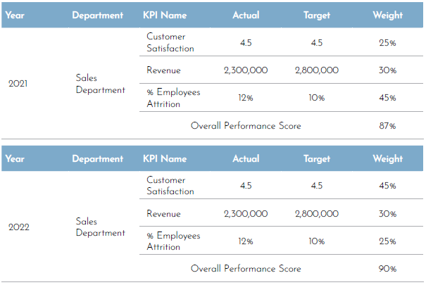
Figure 1. Sales department’s performance in 2022 and 2021
Read More >> Choosing the Right Chart for Your Data: A Purpose-Driven Approach
2. Omitting the baseline in graphs
Arguably, the most common form of misrepresentation in graphs is when its Y-axis is manipulated to exaggerate the differences between bars. The truncated graph is produced when the axis starts from a value other than zero. This might give an illusion that the differences are high.
Even if the audience is informed that the Y-axis was truncated, a study found that they still overestimate the actual differences, and the results are often substantial.
Start the axis at zero to show the true context of the data. This will ensure that the data is presented naturally and accurately, reducing the chances of being misinterpreted.
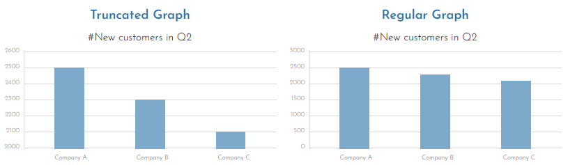
Figure 2. The differences between a regular graph and a truncated graph
3. Small sample size
Darrell Huff, the author of “How to Lie with Statistics”, believed that samples can be trusted only if they are statistically significant. Hence, to be worth much more, a report or analysis based on sampling must use a representative sample, and for it to be relevant, every source of bias must be removed.
For example, a skincare company might advertise its facial wash by putting “users report 85% less skin breakout” on its packages. Upon closer inspection, one may discover that the test group of users consisted of only 15 people. This sample size works well for the skincare company because it is easier to repeat the experiment in a smaller group until they get their desired result while ignoring any findings that do not support how they want to promote their product. Sooner or later, a focus group will show a significant improvement worthy of a headline, and an advertising campaign based on a deceiving result will be created.
There is no clear-cut answer on what the appropriate sample size is since it will be highly dependent on the research type and population size, and there are many statistical methods and equations that could help determine the appropriate sample size, such as Herbert Arkin’s formula or Krejcie and Morgan Table. In addition, when reporting the survey or research results, it’s important to be transparent with the recipient audience and communicate the survey methodology, population, and the logic behind determining the sample size.
4. Misleading averages
While averages can give a simple summary of large data, they might also give half-truths. Case in point, if the range between numbers is too high, then the average would be meaningless. It is optimal that when an average is presented in data, it should be introduced along with supporting facts to provide in-depth analysis and make the right decision at the right time for the business. It is, therefore, important not just to rely on an average but also to look at the distribution of data, understand the range, and consider other statistical measures like median and mode. The median represents central tendency measurements instead of the average or mean because it is less impacted by outliers.
Read More >> Data Governance: Ensuring Accuracy and Reliability in Strategy Management
To conclude, it’s crucial for all stakeholders—whether they’re performance specialists or executives at the top management—to understand how human biases can infiltrate numbers and form a narrative that is completely different from reality. This can be avoided by ensuring that the reported data covers all the quality aspects of completeness, uniqueness, conformity, consistency, and timeliness. In addition, organizations must establish a data validation process to ensure the credence of performance reports.
**********
About the Guest Expert: Wedad Alsubaie, a seasoned Senior Strategy Management Officer at the National Unified Procurement Company (NUPCO), holds certifications in strategic business planning and KPI and performance management. With extensive experience in enhancing corporate and individual performance, she led the performance development program in Mobily and is now focused on corporate strategy and performance management at NUPCO.
Editor’s Note: This was originally published in Performance Magazine Issue No. 29, 2024 – Strategy Management Edition.

Tags: data analytics, performance reporting, statistical factors