How to increase websites’ performance through online user experience
One of the core ideas of Online Audience Optimization is the quality of the experience offered to users when they access the website / webpage.
In order to understand the field’s development, let’s take a look at the past evolution. A few years ago, because of the technological limitations, the websites were more static and less attractive, with lots of constraints in terms of design. With the recent high-tech developments, there are almost no limits in fostering a first line online strategy.
Nowadays, people don’t not just access websites. When you enter a website, you engage with it, based on the available interaction level. Any webmaster intends to create a high level of engagement, as this will increase the probability of conversion, of returning visitors to the site, of recommending it to a friend.
But what exactly is in the user’s mind when he accesses a website? The answer to this question could help us understand how the webmaster strategy has to adapt to the processes that take place in the clients’ minds.
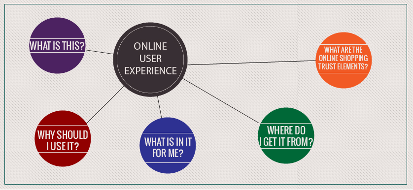
1. When a client accesses the website, the first question that crosses his mind is “What’s this?“. In order to address this question, it is highly recommended to have a good answer on the homepage and a proper meta-description of the webpages. This will reduce the percentage of users that misunderstand the main topic of the website and click on the link popped – up on the search results.
2.” Why should I use it?” This is the second question that comes in users’ mind. It is important to present the benefits of the products the website / company offers. It is a common mistake to assume that the users know what the benefits are.
3. “What’s in it for me?” A short description of the product is required to help customers properly understand their use. Also, there are clients who want more details and in-deep descriptions of the products they are interested in. To fulfil these needs, it is recommended to have a full description of the product in a .pdf or .doc file.
4. “Where do I get it from?” This is the part that actually creates the conversion between the website and the user. It requires a button especially developed to answer this question, through a call for action like “Buy now”, “Get it here”, “Start using it now”, “Get started”. It is recommended to create multiple versions of the webpage / landing page, in order to test the call to action that performs the best among the visitors of the website.
5. “What are the online shopping trust elements?” It is recommended to get your site payment options to a high level of security, by obtaining certifications from online businesses that provide this kind of solutions, such as: denyall, eTrust, Symantec. After the certifications are obtained, don’t forget to post the trust seals on the webpage, as they increase the conversion rate of the visitors by providing confidence.
Being prepared to answer the above listed questions in an intuitive and fast way is the key to having high quality traffic, conversions and satisfied users it ultimately represents the strategy to achieving a high performing website.
Mihai Păculea. Business Research Analyst. The KPI Institute
Tags: Online Audience Optimization, online presence, Online strategy


Career services
| #
Career services
[…]although web-sites we backlink to beneath are considerably not connected to ours, we really feel they may be basically really worth a go as a result of, so possess a look[…]
Reply
FiverrEarn
| #
FiverrEarn
[…]we came across a cool website that you could possibly appreciate. Take a search in the event you want[…]
Reply