Big data has created unrivaled opportunities for businesses. It aids them in achieving faster and deeper insights that can strengthen the decision-making process and improve customer experience. It can also accelerate the speed of innovation to give companies a competitive advantage. Given that we live in a time of data and information overload, we really need to have better mechanisms to make sense of it all. Enter data visualization, which supports the transfer of information to knowledge by illustrating hidden issues and opportunities in big data sets.
A significant amount of the human brain is dedicated to visual processing. This results in our sight having a sharpness of perception far surpassing our other senses. Effective data visualization shifts the balance between perception and cognition. The visual cortex is used at a higher capacity, and the viewer understands the presented information much quicker to make better decisions based on the findings.
Businesses are increasingly turning to data visualization to organize the overwhelming amount and variety of data cascading into their operations and to eliminate the struggle of just storing the data, shifting instead to analyzing, interpreting, and presenting it in a meaningful way. The trend toward data visualization is worth delving into by any business seeking to derive more value from big data.
Tackling big data usually involves the four Vs: volume, velocity, variety, and veracity. However, we must emphasize a fifth V that requires attention, namely visualization. Even with the use of business intelligence (BI) tools and the exponential increase in computing power, the need to consume information in a meaningful manner exceeds the ability to process it.
Visualization plays a key role starting from the raw input of big data, where structures and underlying patterns that may be held within the data can be observed or formed, resulting in a visual representation that presents key insights in an efficient and digestible way.
Crafting data visualization is more than simply translating information in a visual display. It ought to communicate information effectively, with the prime purpose of presenting data in a quick, accurate, powerful, and long-lasting manner.
The main problem with big data involves complexity. Data is growing exponentially with time, as an increasing amount of it is made available on the internet. Furthermore, the number of insights, opportunities or hypotheses hidden in a dataset is exponential to the size of the datasets.
Key performance indicators (KPIs) can be used to achieve efficiency and ensure the comprehensibility of visual representations resulting from big data, attain the goal of graphical excellence, and add value to the result. Big data visualization requires skills and principles that must be carefully learned. Each big data visualization created should follow a clear path to success: attain, define, structure, extract, load, display, refine the data, and interact with it.
KPIs add value to the entire process by ensuring clarity in developing the strategy of the project, focus on what matters and requires attention, as well as improvement by monitoring the progress towards the desired state.
When developing a big data visualization project, the process should follow a cursive and pre-defined flow in accordance with the project needs and the requirements of the end-user. These recommended stages are:
Acquiring the Data
This is usually how the process starts, unrelated to the platform that provides the data. In the process of big data collection, there is also the issue of data selection. Instead of just throwing it all in, one should focus on selecting high-quality data that is relevant to the project’s objective and does not add noise to the end result.
The noisier the data is, the more difficult it will be to see the important trends. It is suggested to have a clear strategy for the data sources required, as well as for the subsets of data relevant to the questions the project wants to answer.
Structuring the Data
The next phase in the process is structuring the acquired data. This includes the process of organizing the data to align it to one standard. The data store might be comprised of a combination of structured, semi-structured, and unstructured data.
At this stage, it is easier to identify the common aspects in each set of data and to find relationships between the data at hand. This includes translating system-specific data coding to meaningful and usable data (the platform where the data will be aggregated does not know that the set of data labeled “Customer No.” is the same as “# Customer” or “ID-Customer”).
Loading and Visual Mode Selection
After cleaning the data, filtering through enormous amounts of data, and replicating the application logic to make the data self-describing, the process continues with loading the data in the preferred platform and choosing the visual mode of representation.
In this stage, we can determine if the background data is very noisy, as the emerging visual representation will be hard to read or irrelevant to the strategic objective of the project.
By implementing KPIs along the project and linking them to the project objectives, the increased value will be added in the form of:
Better quality of the visual representations
Fewer project delays
Less rework along the way
Improved productivity
Greater contribution to the visuals’ value
Enhanced growth and innovation of the visual representation
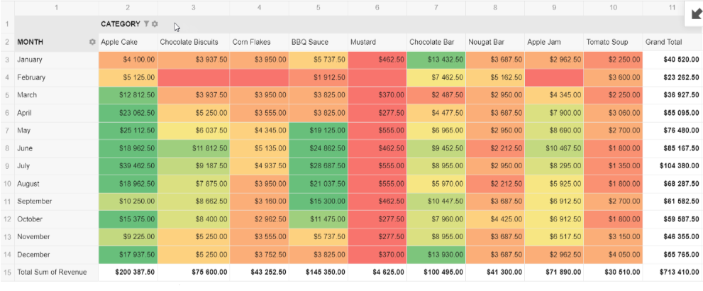
As dashboards, performance reports, and meeting invitations are piling up, a decision must be made or a strategy needs to be developed. This typical workplace scenario can be overwhelming and can make people fixated on numbers. Unfortunately, organizations sometimes heavily rely on such figures to make decisions that prioritize the company’s interests over those of people and the planet. To ensure that a company’s approach to performance reporting and strategic decision-making remains effective and holistic, it is important to understand the different statistical factors causing inaccuracy and inconsistency.
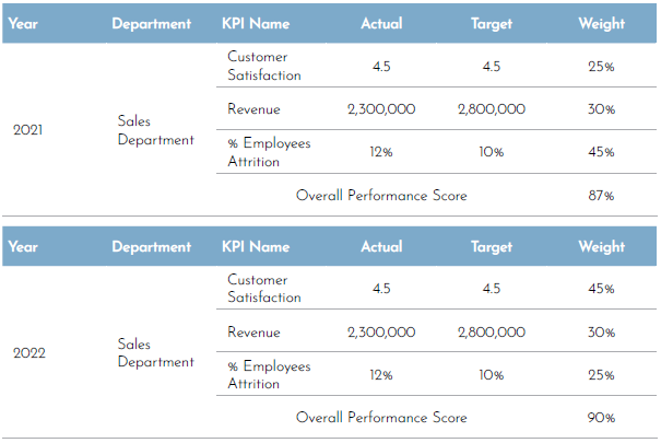
1.Weighted performance scores
Setting priorities and focusing on what matters by correlating importance with a weighted value will definitely facilitate the performance reporting process and is integral to calculating an overall performance score. However, according to The KPI Institute, establishing weight could be subjective and misleading if one is not careful about how to report it because changing weights from one period to another leads to inconsistency of data in time and creates a fallacy of performance improvement or regression.
For example, a report could be presented to the management regarding the improvement in the performance of the sales department from the year 2021 to the year 2022 and that the department performance score has improved by 4%. However, there is a possibility that their performance has not changed at all if all they have done was change the weight of the underperforming key performance indicators (KPIs) to get different results.
To avoid such a misleading presentation, it is important to redirect the conversation to the metrics’ results and not the weighted score or the target. This will drive the decision-maker to concentrate on what matters and see the bigger picture.
Figure 1. Sales department’s performance in 2022 and 2021
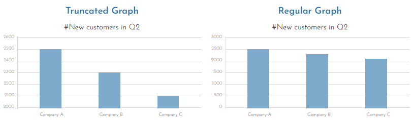
Arguably, the most common form of misrepresentation in graphs is when its Y-axis is manipulated to exaggerate the differences between bars. The truncated graph is produced when the axis starts from a value other than zero. This might give an illusion that the differences are high.
Even if the audience is informed that the Y-axis was truncated, a study found that they still overestimate the actual differences, and the results are often substantial.
Start the axis at zero to show the true context of the data. This will ensure that the data is presented naturally and accurately, reducing the chances of being misinterpreted.
Figure 2. The differences between a regular graph and a truncated graph
3. Small sample size
Darrell Huff, the author of “How to Lie with Statistics”, believed that samples can be trusted only if they are statistically significant. Hence, to be worth much more, a report or analysis based on sampling must use a representative sample, and for it to be relevant, every source of bias must be removed.
For example, a skincare company might advertise its facial wash by putting “users report 85% less skin breakout” on its packages. Upon closer inspection, one may discover that the test group of users consisted of only 15 people. This sample size works well for the skincare company because it is easier to repeat the experiment in a smaller group until they get their desired result while ignoring any findings that do not support how they want to promote their product. Sooner or later, a focus group will show a significant improvement worthy of a headline, and an advertising campaign based on a deceiving result will be created.
There is no clear-cut answer on what the appropriate sample size is since it will be highly dependent on the research type and population size, and there are many statistical methods and equations that could help determine the appropriate sample size, such as Herbert Arkin’s formula or Krejcie and Morgan Table. In addition, when reporting the survey or research results, it’s important to be transparent with the recipient audience and communicate the survey methodology, population, and the logic behind determining the sample size.
4. Misleading averages
While averages can give a simple summary of large data, they might also give half-truths. Case in point, if the range between numbers is too high, then the average would be meaningless. It is optimal that when an average is presented in data, it should be introduced along with supporting facts to provide in-depth analysis and make the right decision at the right time for the business. It is, therefore, important not just to rely on an average but also to look at the distribution of data, understand the range, and consider other statistical measures like median and mode. The median represents central tendency measurements instead of the average or mean because it is less impacted by outliers.
To conclude, it’s crucial for all stakeholders—whether they’re performance specialists or executives at the top management—to understand how human biases can infiltrate numbers and form a narrative that is completely different from reality. This can be avoided by ensuring that the reported data covers all the quality aspects of completeness, uniqueness, conformity, consistency, and timeliness. In addition, organizations must establish a data validation process to ensure the credence of performance reports.
**********
About the Guest Expert:Wedad Alsubaie, a seasoned Senior Strategy Management Officer at the National Unified Procurement Company (NUPCO), holds certifications in strategic business planning and KPI and performance management. With extensive experience in enhancing corporate and individual performance, she led the performance development program in Mobily and is now focused on corporate strategy and performance management at NUPCO.
Editor’s Note: This was originally published in Performance Magazine Issue No. 29, 2024 – Strategy Management Edition.
Isn’t it fascinating how charts can dissolve divides and turn disconnect into discoveries? It’s a purposeful medium where even the fragments and imbalance in the world are always part of the story. By unifying or restructuring grand and small narratives in a more distilled expression, charts make complex truths accessible to a wider audience. Consequently, the audience become not just spectators but also collaborators, peeling meaning from their respective perspectives or contributing to a common understanding. However, producing charts with this level of effectiveness doesn’t just happen through the mere union of analysis and aesthetics.
It starts with choosing the right chart for your data. That choice should be driven by intuitive wisdom and structured control, and both are anchored on purpose. By defining what you need to bring out of the data, you eliminate the unessential and get your message across as quickly and as clearly as possible.
What’s Your Purpose?
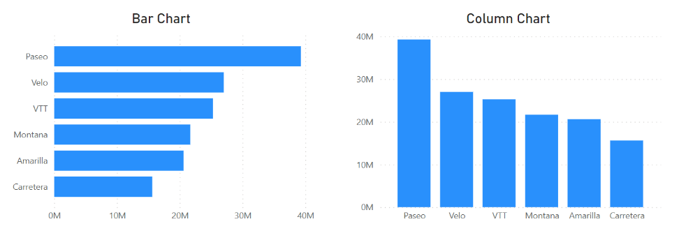
Comparison is a common purpose for data visualization, and the bar chart is the tool to make this happen. Bar charts use one categorical variable and one numerical variable like income data across departments. For more nuanced comparisons, clustered bar charts can be used to introduce another categorical variable, like seniority levels within departments. Bar charts, as shown in Figure 1, have horizontal bars, while another type, the column chart, uses vertical bars.
Figure 1. A bar chart (left) and a column chart (right) | Image Source: Financial Edge
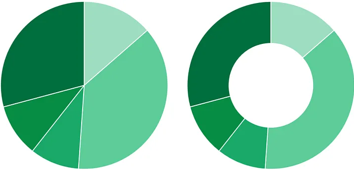
Another purpose for data visualization is to show composition, specifically the contribution of parts to a whole. This type of visualization generally involves one categorical variable and one numerical variable. Composition charts in a matched pair usually take the form of a pie chart or donut chart (see Figure 2). An example of what they can demonstrate is the percentage of customers who prefer one product over another.
Figure 1: A pie chart (left) and a donut chart (right) | Image Source: Medium
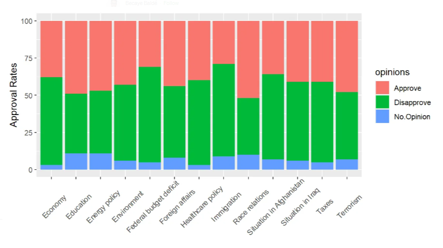
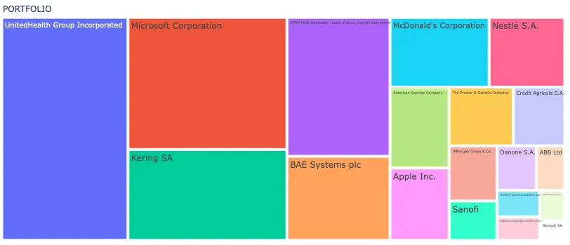
More complex data with multiple categorical variables will benefit more from using stackedbar charts, which are similar to bar charts butwith multiple categorical variables represented as additional parts stacked alongside each other (see Figure 3). Alternatively, complex data can be illustrated using a treemap, which involves dividing a rectangular area into smaller rectangles to represent hierarchical data such as income distribution across regions and cities (see Figure 4).
Figure 3. A stacked bar chart | Image Source: Medium
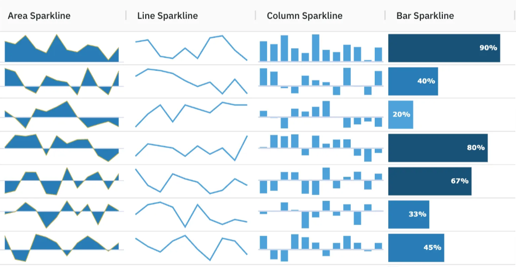
If your purpose is to show change over time in charts, it can be done with line charts or area charts (see Figure 5). The line chart works better when it comes to a numerical variable with a time series, such as monthly revenue. The continuity of the line allows the viewer’s eye to easily notice trends and changes over time. The area chart goes one step further by shading the area under the line, emphasizing both the change and its magnitude. For more compact visualizations within tables, sparklines can be used. These are small charts that may be placed in a sheet’s individual cells and can highlight trends in big data sets or point out maximum and minimum values (see Figure 6).
Figure 5. A line chart (left) and an area chart (right) | Image Source: Edraw
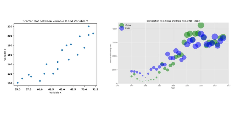
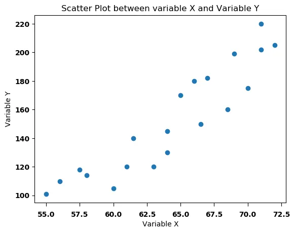
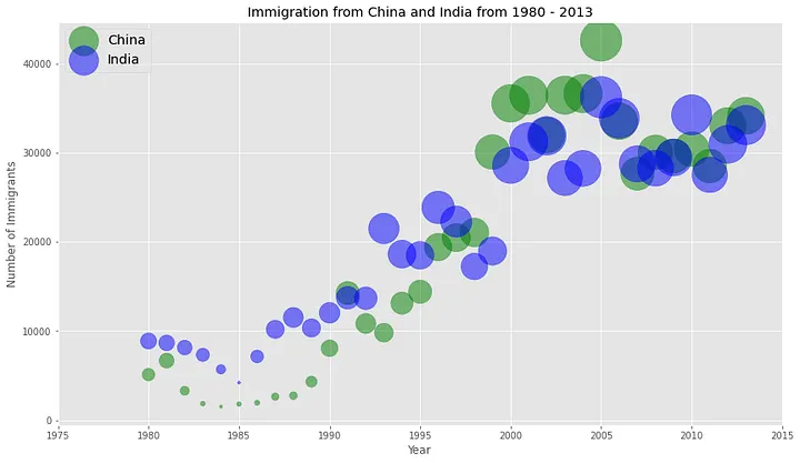
As for visualizing relationships between variables, go with a scatter plot or bubble chart for numerical data and a heat table for categorical data. A scatter plot displays data points to show the correlationof two numerical variables, while a bubble chart is similar to a scatter plot, in which the x- and y-axes consist of two numerical variables, but the bubbles (or circles) in it vary in size to encode a third numerical variable (see Figure 7).
Figure 7. A scatter plot (left) | Image Source: Medium | and a bubble chart (right) | Image Source: Medium
For categorical data, a heat table has one categorical variable placed in rows and another placed in columns. The cells of the table are then coded with numerical values, often by way of different intensities of color. This is a particularly useful way to identify patterns or relationships between categorical variables, such as countries and performance scores (see Figure 8).
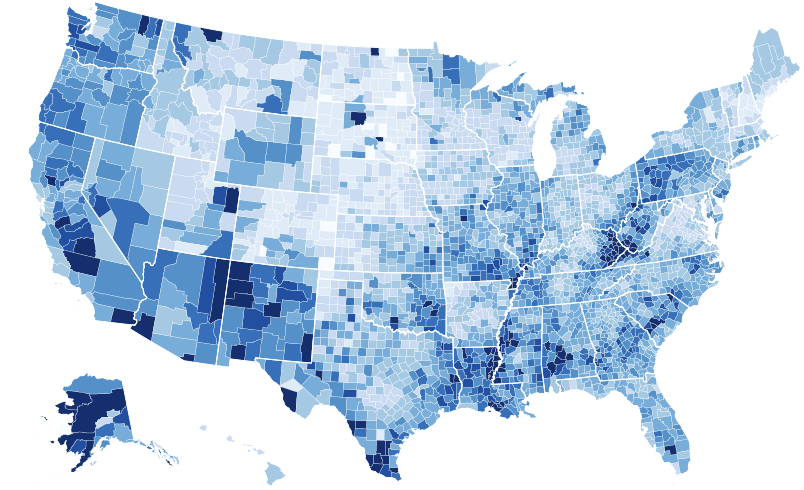
When you’re working with geospatial data, you might find a choropleth map more suitable (see Figure 9). It plots a numeric variable like population density over a geospatial variable such as regions or countries. This type of map illuminates the perception and realization of the spatial pattern by shading particular regions with differing tones.
The right chart for your data isn’t always immediately obvious. By establishing your purpose first, you narrow down your choices. You avoid overcomplicating or underrepresenting information. Another layer of factors to consider is the type of data you have and its size. And beneath all of these is your audience. From their familiarity with charts to the complexity of your data, decision-making always involves the people you are creating a chart for in the first place.
To learn more about data visualization, check out more articles here.
**********
Editor’s Note: This article was written in collaboration with Islam Salahuddin, data consultant at Systaems.
“If communication is more art than science, then it’s more sculpture than painting. While you’re adding to build your picture in painting, you’re chipping away at sculpting. And when you’re deciding on the insights to use, you’re chipping away everything you have to reveal the core key insights that will best achieve your purpose,” according to Craig Smith, McKinsey & Company’s client communication expert.
The same principle applies in the context of data visualization. Chipping away is important to not overdress data with complicated graphs, special effects, and excess colors. Data presentations with too many elements can confuse and overwhelm the audience.
Keep in mind that data must convey information. Allow data visualization elements to communicate and not to serve as a decoration. The simpler it is, the more accessible and understandable it is. “Less is more” as long as the visuals still convey the intended message.
Finding the parallel processes of exploratory and explanatory data visualization and the practice of sculpting could help improve how data visualization is done. How can chipping away truly add more clarity to data visualization?
Exploratory Visualization: Adding Lumps of Clay
Exploratory visualization is the phase where you are trying to understand the data yourself before deciding what interesting insights it might hold in its depths. You can hunt and polish these insights in the later stage before presenting them to your audience.
In this stage, you might end up creating maybe a hundred charts. You may create some of them to get a better sense of the statistical description of the data: means, medians, maximum and minimum values, and many more.
You can also recognize in exploratory if there are any interesting outliers and experience a few things to test relationships between different values. Out of the 100 hypotheses that you visually analyze to figure your way through the data in your hands, you may end up settling on two of them to work on and present to your audience.
In the parallel world of sculpting, artists do a similar thing. They start with an armature-like raw data in designing. Then, they continue to add up lumps of clay on it in exploratory visualizations.
Artists know for sure that a lot of this clay will end up out of the final sculpture. But they are aware that this accumulation of material is essential because it starts giving them a sense of ideal materialization. Also, adding enough material will ensure that they have plenty to work with when they begin shaping up their work.
In the exploratory stage, approaching data visualization as a form of sculpting may remind us to resist two common and fatal urges:
The urge to rush into the explanatory stage – Heading to the chipping away stage too early will lead to flawed results.
The urge to show all of what has been done in the exploratory stage to the audience, begrudging all the effort that we have put into it – When you feel that urge, remember that you don’t want to show your audience that big lump of clay; you want to show a beautified result.
Explanatory Visualization: Chipping Away the Unnecessary
Explanatory visualization is where you settle on the worth-reporting insights. You start polishing the visualizations to do what they are supposed to do, which is explaining or conveying the meaning at a glance.
The main goal of this stage is to ensure that there are no distractions in your visualization. Also, this stage makes sure that there are no unnecessary lumps of clay that hide the intended meaning or the envisioned shape.
In the explanatory stage, sculptors use various tools. But what they aim for is the same. They first begin furtherly shaping the basic form by taking away large amounts of material. It is to ensure they are on track. Then, they move to finer forming using more precise tools to carve in the shape features and others to add texture. The main question driving this stage for sculptors is, what uncovers the envisioned shape underneath?
In data visualization, you can try taking out each element in your visualization like titles, legends, labels, colors, and so on. Then, ask yourself the same question each time, does the visualization still convey its meaning?
If yes, keep that element out. If not, try to figure out what is missing and think of less distracting alternatives, if any. For example, do you have multiple categories that you need to name? Try using labels attached to data points instead of separate legends.
There are a lot of things that you can always take away to make your visualization less distracting and more oriented towards your goal. But to make the chipping away stage simpler, C there are five main things to consider according to Cole Nussbaumer Knaflic as cited in her well-known book, Storytelling with Data:
De-emphasize the chart title; to not drive more attention than it deserves
Remove chart border and gridlines
Send the x- and y-axis lines and labels to the background (Plus tip from me: Also consider completely taking them out)
Remove the variance in colors between the various data points
Label the data points directly
In the explanatory stage, approaching data visualization as a form of sculpting may remind us of how vital it is to keep chipping away the unnecessary parts to uncover what’s beneath, that what you intend to convey is not perfectly visible until you shape it up.
Overall, approaching data visualization as a form of sculpting may remind us of the true sole purpose of the practice and crystalize design in the best possible form.
Deepen your understanding of processing and designing data with our insightful articles on data visualization.
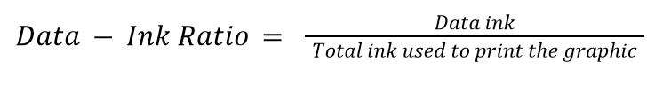
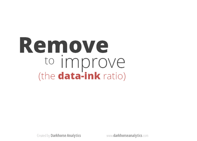
In 1983, American professor of statistics and computer science Edward Tufte introduced the concept of data-ink ratio in his famous book, “The Visual Display of Quantitative Information.” Data-ink ratio is a pioneering disciplinary theory in data visualization that has been highly influential in recommended practices and teachings, with its excellency reflecting a minimalistic style of design. The art movement of Minimalism is noticeable in Tufte’s theory, even though he did not deliberately mention it. However, academic research shows that data-ink ratio generated mixed responses, resulting in the need for more complex frameworks in data visualization.
What is Data-Ink Ratio?
Tufte’s Data-Ink Ratio is built on his preposition that “data graphics should draw the viewer’s attention to the sense and substance of the data, not to something else.” The conceptual formula is:
“Data ink” means what is absolutely necessary to show the data. The word “ink” is used because the theory was formulated in the age of print graphics dominance. The equivalent of “ink” in the digital world today is “pixels.” Data-ink ratio aims to find and maximize the share of informative elements out of the total elements used in a chart, raising a ratio of 1 as the highest goal. A visualization with such a ratio is the one that only contains elements that show the data, with no decorations or redundancies.
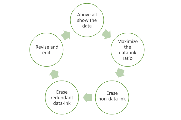
Tufte asserted this goal by articulating two erasing principles: “erase non-data-ink, within reason” and “erase redundant data-ink, within reason.” For these two types of ink, he coined the term “chartjunk.” The excessive elements to get rid of include decorations, background images, unnecessary colors, gridlines, axes, and tick marks. He said that the principles should be applied through editing and redesign. This led to the structuring of the process of data visualization as a cyclical one that ends when the most minimal output is reached.
Minimalism became one of the most important and influential movements during the professor’s young age in the 1960s. Minimalism is defined by Cambridge dictionary as “a style in art, design, and theater that uses the smallest range of materials and colors possible, and only very simple shapes or forms.” It is a kind of reductive abstract art that is characterized by “plain geometric configurations” that lack “any decorative… flourishes.”
That can be juxtaposed with what Tufte instructed under the data-ink ratio theory: to achieve a data visualization that is simple and, therefore, minimal. Tufte’s theory suggests that such simplicity can deliver a message that is clear, precise, and efficient. As a result, it could reduce the time required for the user to perceive the visualization.
One of the many posts surfacing the internet to exemplify applying Tufte’s reductive principles on a bar chart. | Image Source: Darkhorse Analytics
Tufte’s priorities match the needs of the fast-paced business world. In business, saving time means saving cost and therefore maximizing profit. It was in the nineties, less than a decade after Tufte’s theory, when the accumulation of information started to skyrocket with the advancement of the World Wide Web. Businesspeople seemed to be lacking even more time with more information to consider, and a minimalistic approach seemed like a solution.
Minimalism did not only impact data visualization, but its effect also reached almost every corner of the human computer interaction (HCI) field. For example, as the internet became more widespread, search engines started to develop and became so powerful that they began to impose their own rules of the game. Because of the nature of how search engines work, the minimalistic structured design of web pages was more attainable for the engines to read and rank, and therefore more preferable and reachable for the audience.
For similar benefits, like reach in webpages and efficiency in data visualizations, minimalistic design became so invasive in all computer interfaces over the years. Today, minimalistic design is usually described as “modern design” and recommended to every designer building a user-interaction system, from mobile apps to webpages to data visualizations.
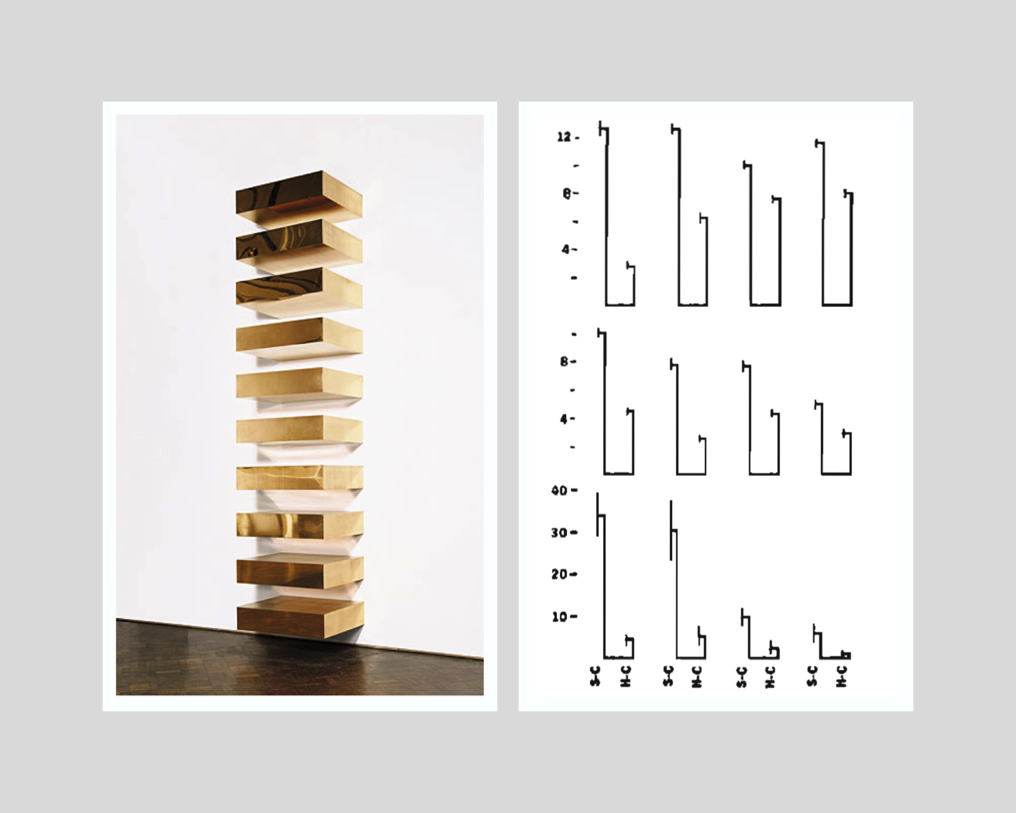
On the left: Donald Judd’s minimalist installation, Untitled, 1969 (photo from: Guggenheim Museum, New York) | On the right: Tufte’s minimalist variation of a double-bar chart with error lines. | Collage made by Islam Salahuddin
Reviews of Data-Ink Ratio’s Minimalism
Despite presenting his hypotheses as proven facts, Tufte had never empirically tested his promised achievements that can be reached by minimalistic design. It was not until the beginning of the nineties that academic research started to put the claims under the microscope.
The initial research findings struggled to prove the hypotheses. However, a major multi-experiment research paper in 1994 found that some non-data-ink and redundant data-ink, especially backgrounds and tick marks on the y-axis, may decrease accuracy and increase response time (which is proportionally bad). Meanwhile, the other ink that Tufte considered to be chartjunk and called for its removal whenever possible, like axis lines, was proved to increase performance in some cases. The negative effect was clear in some chartjunk types, like axis lines, but was less certain in others, like three-dimensional charts.
Such experiments were still built on the same proposition of Tufte that graphical excellency means clarity, precision, and efficiency but found that the relationship between data-ink ratio and excellency in that sense can hardly be linear as Tufte suggests. The paper states that “effects of ink are highly conditional on the features of the graph and task” and therefore “simple rules like Tufte’s will not suffice.” Instead of indicating that all non-data-ink and redundant data-ink should be erased, the authors call on data visualization designers to determine whether the use of any ink will facilitate or interfere with reading a graph, depending on its context.
Later research even questioned Tufte’s components of graphical excellency, especially the presumed all-cases importance of response time factor. An empirical paper in 2007 found that users may prefer non-minimalistic visualizations over Tufte’s minimalistic ones, partially because they may find the latter boring. This is a criticism that both Minimalism art and statistics face and a perception that Tufte tried to avert with his rule. Boredom should not be treated as a minor problem because it means less ability to induce attention. A visualization’s ability to generate attention is the gateway to the viewer’s perception in the first place.
Attention is one of the criteria that Tufte’s rule overlooks. Other significant factors are memorability and engagement. More advanced experiments in 2013 and 2015 re-asserted chartjunk as not always harmful. In some cases, it may even increase the memorability and engagement of a visualization. Attributes like color and human recognizable shapes, icons, and images can enhance memorability due to their ability to activate more parts of a viewer’s brain, leveraging its natural tendency towards what is familiar rather than what is just minimal.
Despite their popularity, chartjunk and similar terms also appear to be highly open to interpretation among practitioners. Interpretation can be affected by an individual’s circumstances that include culture, personal style, preferences, and views, as well as constraints of skills, tools, and user’s priorities, according to a discourse analysis that was published in 2022.
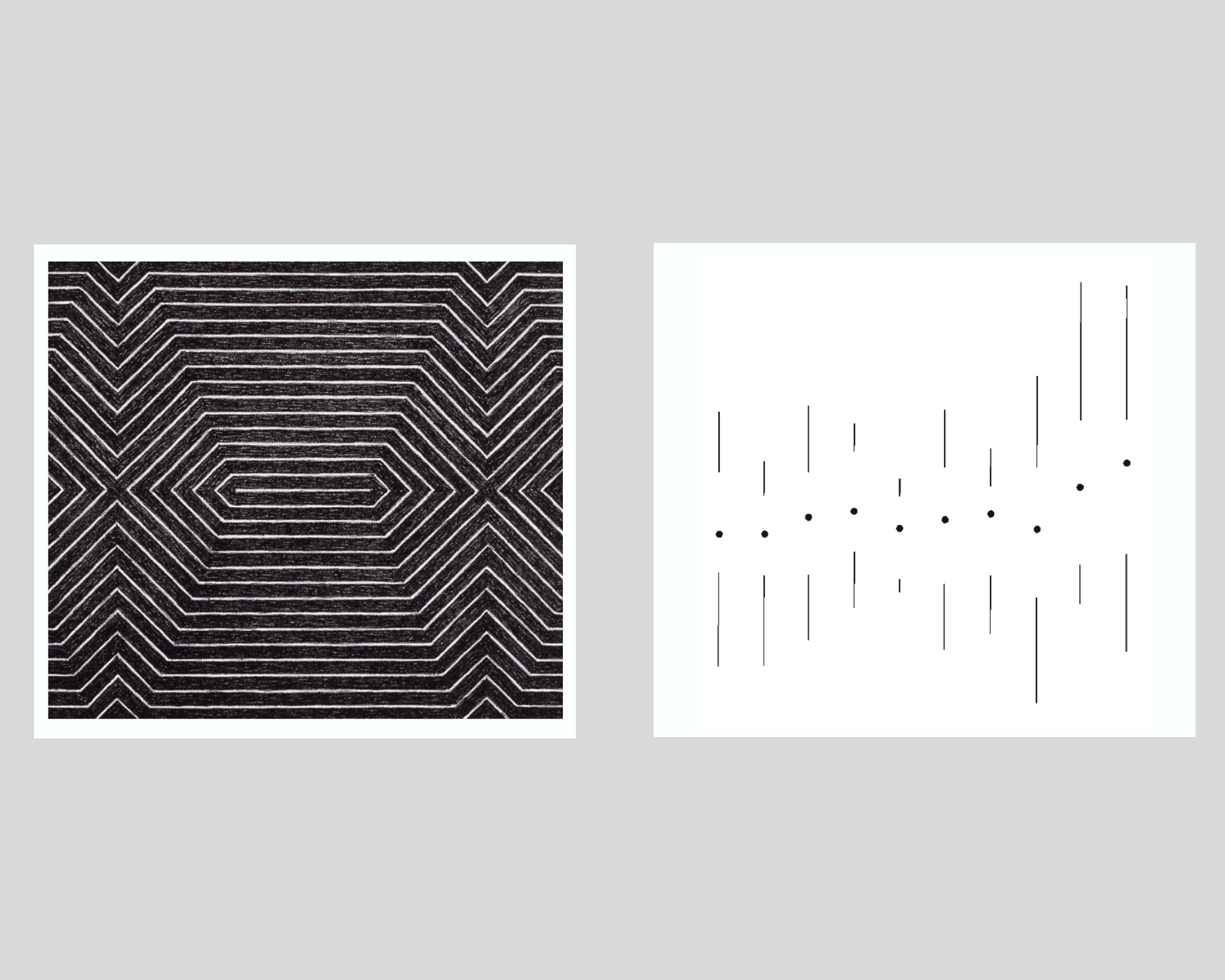
On the left: Frank Stella’s minimalist painting, title not known, 1967 (photo from Tate Modern) | On the right: Tufte’s minimalist variation of a multiple vertical box and whisker plot. | Collage made by Islam Salahuddin
How to Make Sense of the Previous Discussions
The growing body of research shows that data visualization is a task that can hardly be led by only a one-factor rule like data-ink ratio. It shows that even the simple task of choosing what elements to include or exclude in a visualization remains largely an uncharted territory and needs further examination.
However, one of the common underpinnings that all theoretical works share is a consideration for the importance of context in which a visualization is designed. To be fair, even Tufte himself did not ignore this consideration after all and emphasized that certain principles have to be adopted “within reason.” Asserting the “reasonability” factor, he deliberately mentions in the Data-Ink Maximization chapter of his book that maximizing data-ink “is but a single dimension of a complex and multivariate design task.” He recognized the possible existence of factors other than excellency that come into play, including “beauty,” even if he did not prioritize them.
Therefore, synthesizing all the critiques arising against Tufte’s rule of data-ink ratio appears to be possible by quoting Tufte himself. He said that determining to which extent the data-ink ratio should be maximized rests on statistical and aesthetic criteria.” This allows data visualization designers to figure out the sweet spot where a visualization delivers what it intends to and, at the same time, does not alienize itself for the sake of being minimal.
All in all, minimalism can be considered one of the means to design a great data visualization, but not a goal. After all, the goal will remain to deliver the intended message to the audience so they can perceive it best.


