Choosing the Right Chart for Your Data: A Purpose-Driven Approach

Image Source: Freepik
Isn’t it fascinating how charts can dissolve divides and turn disconnect into discoveries? It’s a purposeful medium where even the fragments and imbalance in the world are always part of the story. By unifying or restructuring grand and small narratives in a more distilled expression, charts make complex truths accessible to a wider audience. Consequently, the audience become not just spectators but also collaborators, peeling meaning from their respective perspectives or contributing to a common understanding. However, producing charts with this level of effectiveness doesn’t just happen through the mere union of analysis and aesthetics.
It starts with choosing the right chart for your data. That choice should be driven by intuitive wisdom and structured control, and both are anchored on purpose. By defining what you need to bring out of the data, you eliminate the unessential and get your message across as quickly and as clearly as possible.
What’s Your Purpose?
Comparison is a common purpose for data visualization, and the bar chart is the tool to make this happen. Bar charts use one categorical variable and one numerical variable like income data across departments. For more nuanced comparisons, clustered bar charts can be used to introduce another categorical variable, like seniority levels within departments. Bar charts, as shown in Figure 1, have horizontal bars, while another type, the column chart, uses vertical bars.
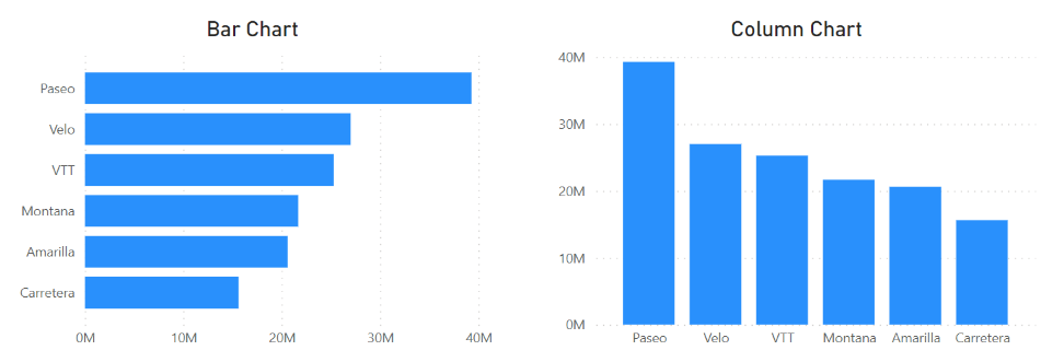
Figure 1. A bar chart (left) and a column chart (right) | Image Source: Financial Edge
Another purpose for data visualization is to show composition, specifically the contribution of parts to a whole. This type of visualization generally involves one categorical variable and one numerical variable. Composition charts in a matched pair usually take the form of a pie chart or donut chart (see Figure 2). An example of what they can demonstrate is the percentage of customers who prefer one product over another.
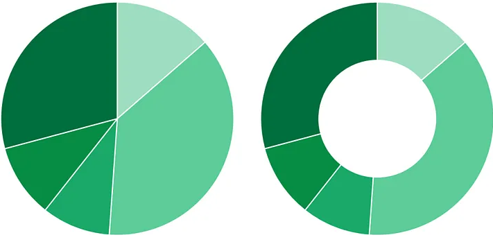
Figure 1: A pie chart (left) and a donut chart (right) | Image Source: Medium
More complex data with multiple categorical variables will benefit more from using stacked bar charts, which are similar to bar charts but with multiple categorical variables represented as additional parts stacked alongside each other (see Figure 3). Alternatively, complex data can be illustrated using a treemap, which involves dividing a rectangular area into smaller rectangles to represent hierarchical data such as income distribution across regions and cities (see Figure 4).
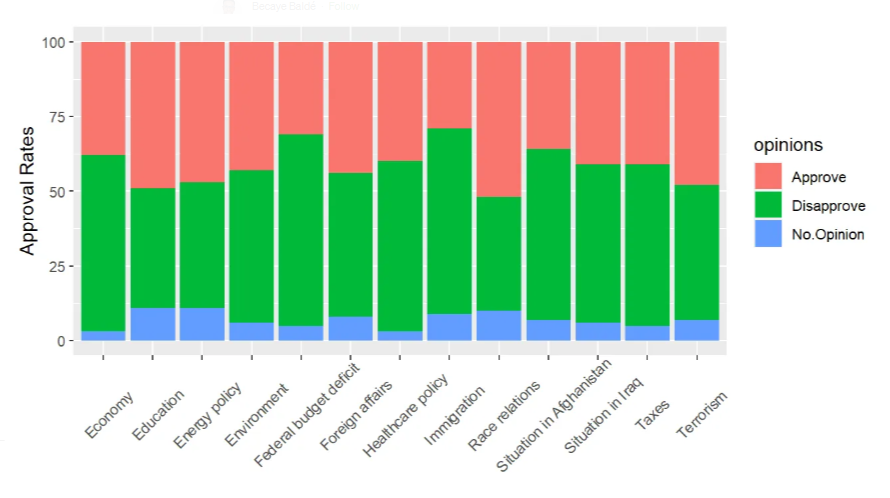
Figure 3. A stacked bar chart | Image Source: Medium
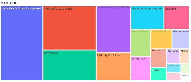
Figure 4. A treemap | Image Source: Medium
If your purpose is to show change over time in charts, it can be done with line charts or area charts (see Figure 5). The line chart works better when it comes to a numerical variable with a time series, such as monthly revenue. The continuity of the line allows the viewer’s eye to easily notice trends and changes over time. The area chart goes one step further by shading the area under the line, emphasizing both the change and its magnitude. For more compact visualizations within tables, sparklines can be used. These are small charts that may be placed in a sheet’s individual cells and can highlight trends in big data sets or point out maximum and minimum values (see Figure 6).
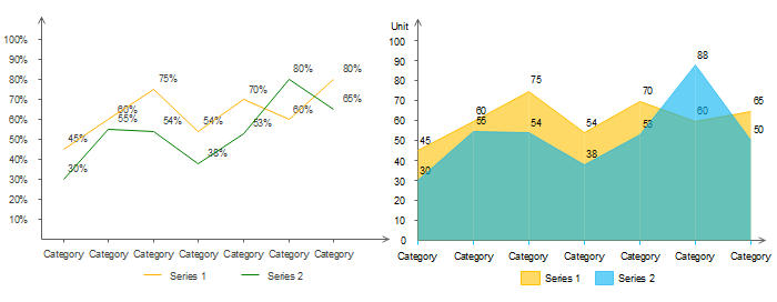
Figure 5. A line chart (left) and an area chart (right) | Image Source: Edraw
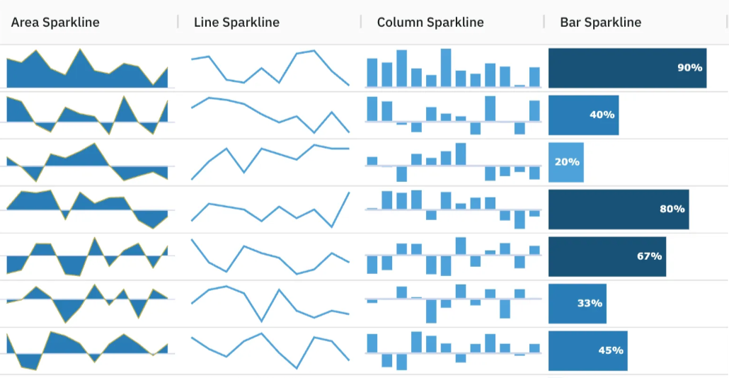
Figure 6. Sparklines | Image Source: Medium
As for visualizing relationships between variables, go with a scatter plot or bubble chart for numerical data and a heat table for categorical data. A scatter plot displays data points to show the correlation of two numerical variables, while a bubble chart is similar to a scatter plot, in which the x- and y-axes consist of two numerical variables, but the bubbles (or circles) in it vary in size to encode a third numerical variable (see Figure 7).
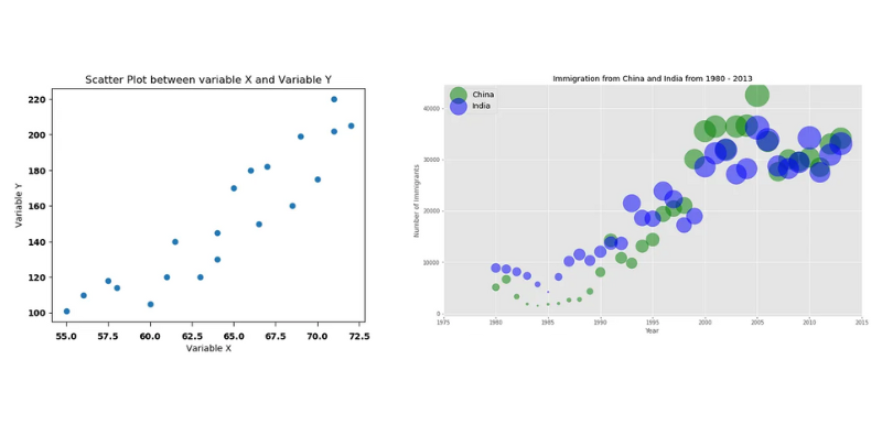
Figure 7. A scatter plot (left) | Image Source: Medium | and a bubble chart (right) | Image Source: Medium
For categorical data, a heat table has one categorical variable placed in rows and another placed in columns. The cells of the table are then coded with numerical values, often by way of different intensities of color. This is a particularly useful way to identify patterns or relationships between categorical variables, such as countries and performance scores (see Figure 8).
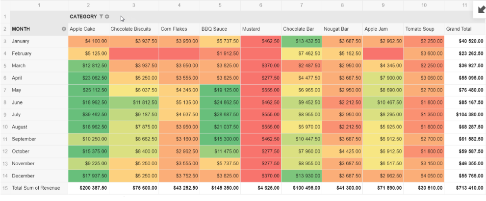
Figure 8. A heat table | Image Source: Medium
When you’re working with geospatial data, you might find a choropleth map more suitable (see Figure 9). It plots a numeric variable like population density over a geospatial variable such as regions or countries. This type of map illuminates the perception and realization of the spatial pattern by shading particular regions with differing tones.
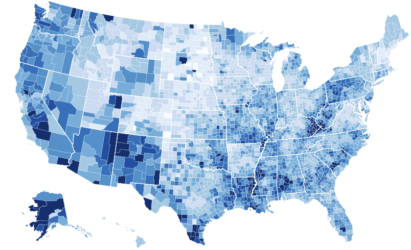
Figure 9. A choropleth map | Image Source: Medium
Final Tips
The right chart for your data isn’t always immediately obvious. By establishing your purpose first, you narrow down your choices. You avoid overcomplicating or underrepresenting information. Another layer of factors to consider is the type of data you have and its size. And beneath all of these is your audience. From their familiarity with charts to the complexity of your data, decision-making always involves the people you are creating a chart for in the first place.
To learn more about data visualization, check out more articles here.
**********
Editor’s Note: This article was written in collaboration with Islam Salahuddin, data consultant at Systaems.

Tags: charts, Data Visualization

