Top practices for basic Web Design
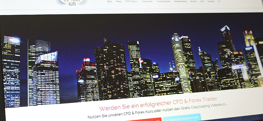
There is a lot to consider when creating a website, from the uniqueness of the design to its feel and functionality.
Factors like the company’s brand, usability considerations, website architecture as well as search engine optimization, hosting requirements, e –commerce, factors – all of these need to be successfully fused into one cohesive website design. Even though each web design project has different requirements, there are some design principles and best practices that apply universally when it comes to designing or re-designing a website.
- Layout Design: First impressions count

As simple as it may seem, creating a compelling layout is not a facile feat and requires very good knowledge of basic design principles such as logo and navigation items-creation within pages, perfect geometrical alignment and a good balance between text, images and white spaces.
The best way of creating the ideal layout for your website is to start from a basic structure and then customize it accordingly. Using anything from simple columns and grid systems to CSS designs or CSS + JavaScript as a foundation is especially good to showcase the contents of your website.
- Graphics and Colors

Visual representation is one of the most important aspects when it comes to compelling visitors to navigate and discover your website, which is why using colors and graphics to convey meaning is a must. The web designer also has to make sure that this enhances his site’s attractiveness rather than distract the viewer, as well as making sure each displayed graphic serves a clear purpose.
As a general rule of thumb, a well-balanced web design uses a maximum of four colors at most as well as text colors which contrast well with the background, to increase readability. Also, animated images and video files must be optimized for web experience since they can considerably slow down load times and downloads.
- Content, Content, Content
Organizing content can become problematic when there is a large amount of information, and it needs to be clear and perfectly layered in order to not confuse visitors. Think about it this way: of all the things on your website, content is what keeps visitors coming back.
There are a few things to consider when we speak of content, such as the consistent use of fonts, font colors and font sizes, as well as presenting the text in a quick, readable fashion and making sure that is accessible and laid out in an organized fashion.
It is also important to keep in mind that is not necessary to fill in every single corner of the website with content. You can make good use of white space on your website by parallax scrolling or simply rearranging it to emphasize your content and offer your users a pleasurable reading and browsing experience.
- Good Flow and Error-Free Navigation

Without proper navigation, a website would be reduced to a showcase page. The first step is to make sure that all the hyperlinks are working and not broken. Good navigation practices include clearly labeling the main navigation links in the site footer and showcasing a site map, with the company logo redirecting the user back to the homepage.
Separating action links (“log in”, “register”, “shop”) from the other links in your navigation board can also go a long way to ensuring a better functionality since users expect to see these action links on the right side of the bar, so reversing the pattern would impair usability.
Keep the flow of the website as simple and intuitive as possible in order to make sure that guests will have an enjoyable experience and find any piece of information quickly and efficiently.
- Sound functionality

From JavaScript errors to internal and external hyperlinks, everything needs to run like clockwork in order for a website to be functional. But that also requires you to encompass everything from the aforementioned items and many more in its script: it has to be mobile-friendly, run on old browsers and even more so – function across various operating systems and mobile devices.
The emphasis on functionality is mandatory when designing an e-commerce website, where functional design is crucial. Functional design is a process of responding to the needs or desires of people who will want to use an item in a manner that allows their needs or desires to be met.
Fundamentally, web design is the art of creating, implementing and fine tuning all of these elements until they work seamlessly and create an unforgettable experience for the user. They key point is to thoroughly think about your audience as a central part of the creative process and make sure not to leave the users out of the design thought process.
Image sources:
Tags: Design Performance, Digital marketing performance


